Blog

Showhouse-2011-010

Showhouse!

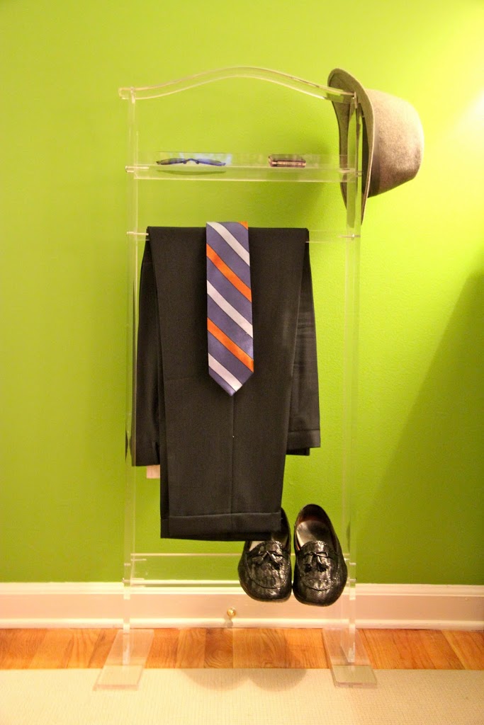
After a busy summer, the latest Patti Johnston Designs fall undertaking was the 2011 Mansions and Millionaires Design Showcase 2011. Patti Johnston Designs took a second-floor foyer and closet and turned it into a sparkling “Boudoir” – an intimate, elegant dressing room combining classic and modern elements.  
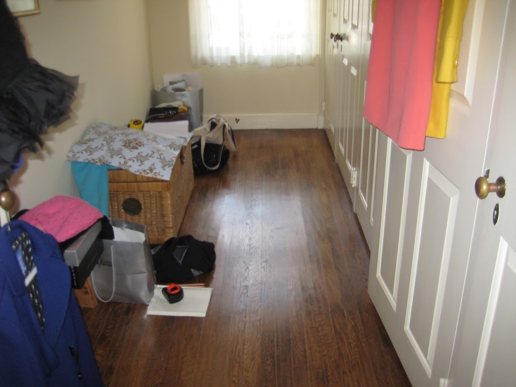
The Space, Before

Boudoir is a space that combines the elegance of classical furniture with modern color and details—preserving the old world feel while bringing the room into the 21st century for today’s woman and man. I chose a color pallet of gray and white, infused with pops of bright turquoise. The closet doors were painted gunmetal grey to ground the room in tradition and are labeled “his,” “her’s,” and “ours.” 
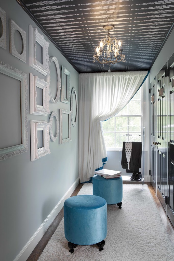
The Space, After

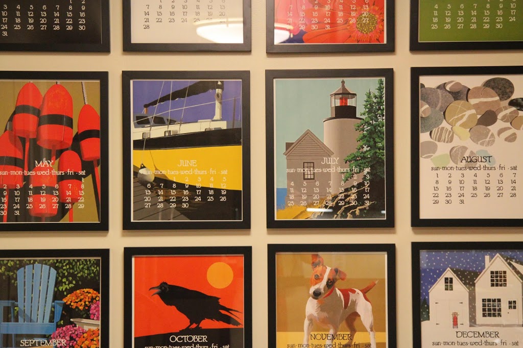
I discovered the ornate vintage picture frames in the attic of a “frame hoarder.” After determining the ideal layout of the frames for the wall, I had them lacquered a glossy white.


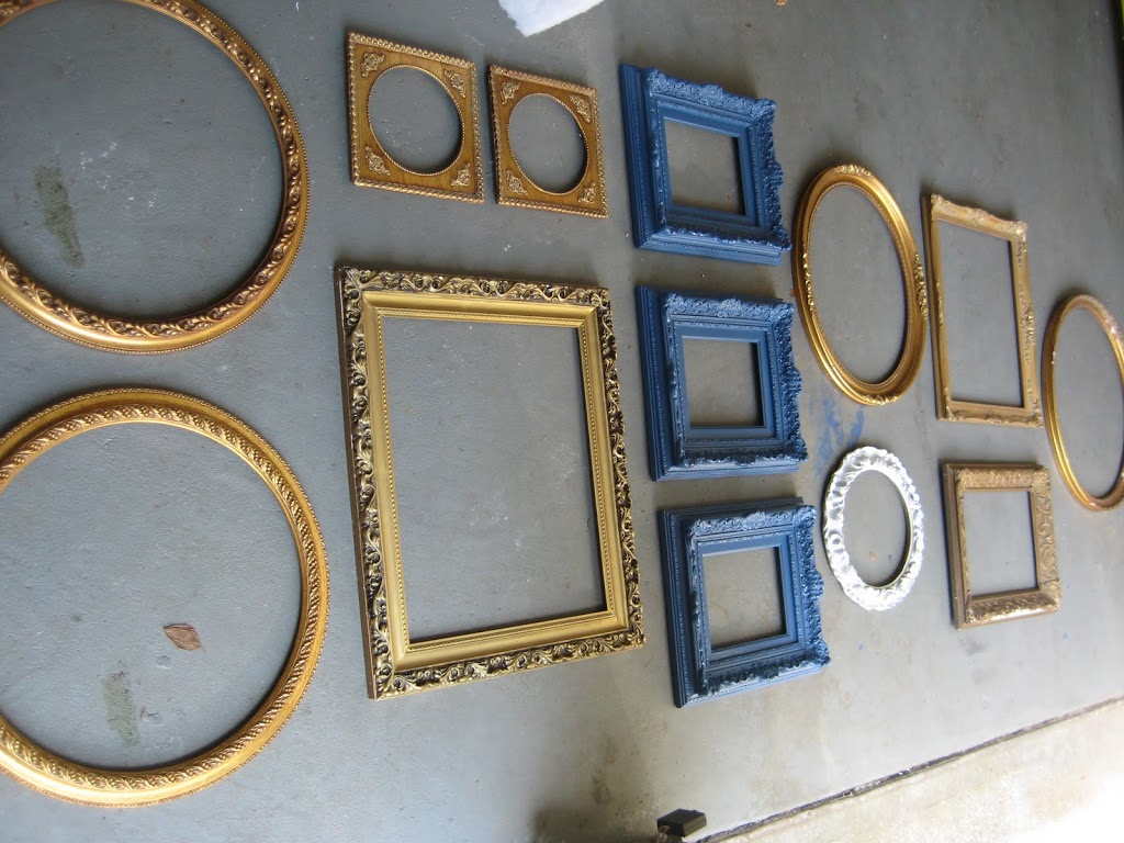
The Frames, Arranged, Before

I wallpapered the ceiling with a modern botanical. The ferns are reminiscent of the home’s beautiful grounds, and introduce an organic motif in the space, which is complemented by the spectacular installation on the wall. The Sculpt du Fleur is a custom floral element created by Nina Helms, incorporating both European influence and contemporary shapes. 

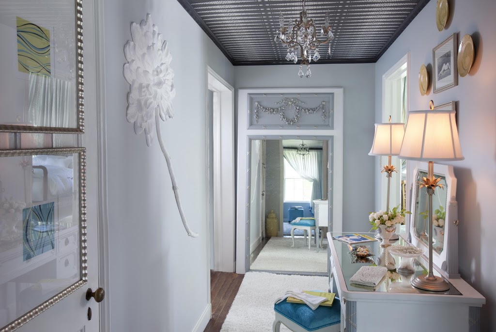
The turn-of-the century vanity and the pier mirror were finds I discovered during an antiques shopping trip in France. They have been restored and rejuvenated with fresh paint and metallic leaf detail. The black lacquered legs of the stools are reminiscent of French design as well. 


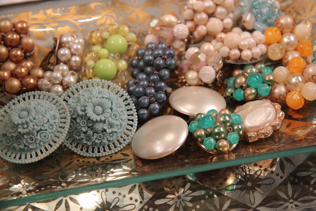
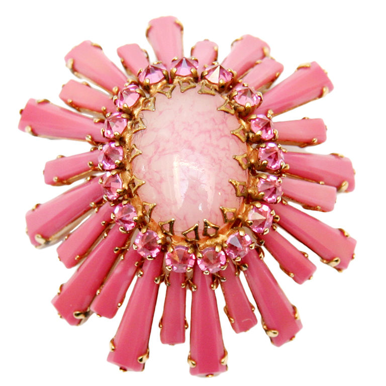
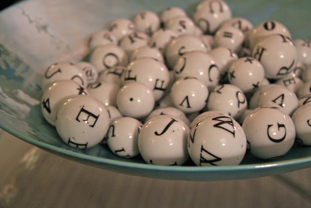
Vintage Jewelry Displayed on the Vanity

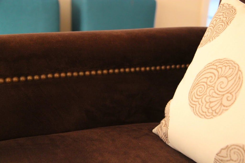
In keeping with the room’s true purpose, I “dressed” the window treatment in filmy white fabric trimmed with gorgeous turquoise satin, fabric reminiscent of a beautiful ball gown.


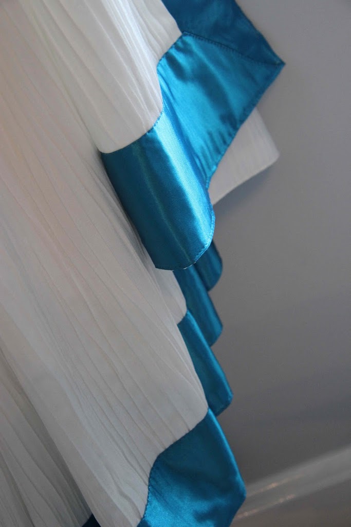
Window Treatment Detail 
CAPRI-BLUE

My Favorite Things

Here is my must-have list . . . the ten things I couldn’t conceive of living without. 


1. Volcano scented candles from Anthropologie 

Volcano Candle

2. Vintage jewelry 

Pink Schreiner Pin
3. Decorating with shells

4. Dune fragrance 
Dune Fragrance by Dior

5. My beautiful bathtub – “Tea for Two” by Kohler 

Patti Johnston Designs Porfolio

6. Going out to breakfast


7. My KitchenAid Artisan Stand Mixer

Susan G. Komen KitchenAid Stand Mixer

8. Weekly reflexology massages


9. Searching for and purchasing mid-century furniture 

Century Design Ltd, Midcentury Slipper Chairs

10. Junior League cook books 

New York Junior League Cookbook

IMG_5644

Paper Projects

Wallpaper can be a misnomer, because limiting wallpaper to the walls would be so restricting! I also like to think of wallpaper as…

…ceiling paper.
Papered Ceiling
…on the back of a simple bookshelf, for a striking backdrop to a collection. 
Lucky Magazine
…on furniture. Furniture pieces can be custom upholstered in textured paper and then painted. This one is a lacquered grasscloth. 
Bungalow 5, on Polyvore
…on the treads of your staircase. 

Moroccan Stencil Staircase, via Style-Files.com

…as art. A great statement idea if you are renting your space, so you can take your wallpaper with you if you move.

Credits: Domino Magazine

Of course, wallpaper is beautiful on the walls. Here are a few Patti Johnston Designs wallpaper favorites for all your paper projects. 

Romo


Nina Campbell

Sanderson

Designer’s Guild
Cole and Son

Purple Hyacinth ca. 2001

Perfect Purples and Blues for Spring

Spring on Long Island always brings to my mind rich blues and purples . . . from the sunny skies reflecting off the sound, to brightly hued purple hyacinths popping up on the front lawn, to the robins’ eggs that reappear each year on our back deck. 
Better Homes and Gardens Magazine
 Last year, during one of my favorite annual New York City events – the biannual New York Junior League House Tour – one of the featured homes was the Grammercy Park town home featured on the magazine page below. The otherwise neutral kitchen’s spectacular ceiling was painted a rich hyacinth purple, which was complemented by purply hues in the art, on the painted floor, and in accessories. 


Better Homes and Garden Magazine


True blues are so fresh and inspiring after the icy whites of wintry skies, and I’m turning to a few favorite blues in my springtime design plans. (All swatches courtesy House Beautiful.) 

Benjamin Moore ‘Blue Wave’ 
Benjamin Moore ‘Glass Slipper’

Benjamin Moore ‘Iceberg’

Benjamin Moore ‘Paladian Blue’

Benjamin Moore ‘Silver Grey’

Benjamin Moore ‘Silvery Blue’

Farrow & Ball ‘Borrowed Light’

A P.S. to any New York based blog readers. The New York Junior League Sixteenth Annual Spring House Tour is Saturday, May 7th, and is an exceptional event that I always enjoy! Details of the event are on the below invitation. 


Damien_Hirst_dots

Lots of Dots

I love the shape of a circle and I use it over and over in my design projects. I find comfort in the round edges and the idea that there is no beginning or end (very Zen!). Whether it’s a print on a fabric or wallpaper, the rounds in an art piece, or accessories, I can’t think of a dot I’ve ever met that I didn’t like!

Art by Damien Hirsht

A few examples of my dot obsession:

Egg prints.
A bowl full of interesting accessories.
Dishes on display.
The medallion shape on this great pillow fabric.
Right now I’m working on selecting a fabric for a glamorous bedroom marrying rich black lacquer with luxurious metallic grays. You guessed it! A beautiful fabric with dots is what I think will do the trick. It’s hard to decide; they are all so beautiful in their different scales!

MP900432928

Loving Lucite

Spring is a great season to visit local tag sales since your neighbors are likely doing their spring-cleaning like the rest of us! Some of my favorite accessories and furniture pieces have been from tag sales and flea markets-from the Patti Johnston Designs headquarters in Long Island, New York, to antique markets in Paris!

  
Recently I found two incredible Lucite items at local shops. The first is this unique men’s valet. Unless a suit and accessories are draped on it, it almost disappears into the background.
Lucite Valet
It’s clean lines and practicality makes it perfect in a guest room. It’s a modern, welcoming piece that allows guests to make themselves—and their clothes—comfortable!
Lucite Valet, dressed
This interesting table base was also a local find. When I first saw it, I knew I had to have it but wasn’t sure how I’d use it! I considered putting it’s two pieces front to back, instead of as a round, to use as a console, but the result was a bit too modern for my home-and I couldn’t part with this find! Instead I positioned them back to back, had a piece of glass cut, and swapped out my traditional mahogany kitchen table for this great, fresh new table.
Kitchen Table 
If you’re inspired to add the look of Lucite to your home, you might try your luck on an upcoming Spring Saturday. You might also consider this contemporary acrylic coffee table from Crate and Barrel. It would disappear in a small space but would by no means be transparent! It’s great shape and functionality would make it a great piece in any room!
cb2
logo

Fabulous Finds

Abacus Gallery calendar designs by Dana Heacock, a Maine artist with a very colorful, graphic style, are one of my favorite things! These calendars are made of individual prints featuring each month of the year as they would appear in New England. Each one is a work of art in and of itself.

Red Rocker by Dana Heacock 

Displayed individually, or in a grouping as I did in the installation below, makes for a powerful graphic statement on a kitchen wall. The design is so great, all that’s needed is a simply gallery frame to see the whole year at a colorful glance! 

Kitchen Calendar Installation
Facebook-icon

Find Me on Facebook!

Dear blog fans, 

Patti Johnston Designs is on Facebook! Please friend PJD for updates, information, and photos! We’ll be updating the page alongside the blog and will feature lots of great information and inspiration. See you there! 

logo

The Amsterdam

One of my most recent Patti Johnston Designs installations is now complete! I recently completed two model homes in the Amsterdam at Harborside, a beautiful retirement community. Featuring a fresh color palette, furniture that blends traditional elements and modern living, and bright, open spaces, the Amsterdam project demonstrates functionality in design and welcomes visitors with bright, inviting color palettes. 

This post is dedicated to a large, two-bedroom unit that combines some of my favorite current color combinations. 

Master Bedroom Window Treatments

The window treatments in the master bedroom are bold in their large scale, but pull together the colors used throughout the room: neutral walls and carpet with a bold green chair and pillows. Yellow lamps carry the color throughout the room, and the pattern is repeated on the lumbar pillow on the bed. 

Master Bedroom

The large open living space brings in more sunny yellow, but varies the color palette with the incorporation of aqua—a Patti Johnston favorite, and touches of warm tangerine orange. Antique lamps bring all the colors together for a traditional touch.  Plenty of seating will accommodate a large family gathering or an evening of relaxing on the ample sofa with a good book or television show! 

Living Room


The yellow and aqua is incorporated into a second bedroom, which could function as a guest room and an office. The showpieces of this room include the fantastic butterfly art and the yellow leather upholstered ottomans with nail head designs that feature their unique shape. 

Office/Guest Room

Stay tuned for more updates from the Amsterdam project, and check out my updated Portfolio to see more images from the installation. 

images-1

The New York International Gift Fair

One of my favorite events in New York City is the not-to-be-missed bi-annual International Gift Fair, which fills up the Javits Center in midtown Manhattan with plenty of design inspiration. This February I spent two days combing through booth after exciting booth to find treasures for current and future projects. 

This year, the handmade exhibits featured some truly amazing handmade items. My eye was immediately caught by the eye-popping colors of hand-woven throws draped around a small booth. Made with care by South American artisans in Bolivia and Guatemala, the natural alpaca wools were died colors that perfectly fit my signature color palate. 

Carpenter + Company

Baskets from Senegal presented the perfect storage solution for some of my current design projects. The most wonderful feature of the companies showcasing these handmade products, beyond the great design they offer, is that they support talented artisans across the globe. 

Swahili Imports

Other wonderful finds included this versatile contemporary bookcase. A pair would be great in any room! I was particularly drawn to the Greek key cutout design, allowing a sneak peak of the collection showcased on its shelves. 

Adler Radcliffe Etagere

These candy colored pillows literally called to me from across the convention space! The collection is full of bold and bright geometric patterns embroidered or printed on high quality fabrics. Sometimes I’ll base an entire room’s design around a great pillow or bold fabric.This collection of pillows could have inspired many! 

Trina Turk 

I am looking forward to incorporating some of these great items into the Patti Johnston Designs Portfolio.