Blog

A Funky Front Door for Fall

Fall Front Door

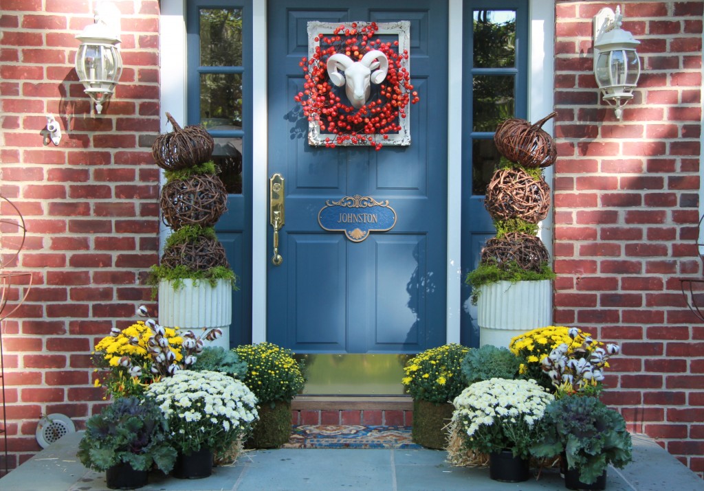
Usually, fall decorating brings to mind leaves, pumpkins, and earthy tones. But this season I wanted my front door to reflect the inside of my home and my aesthetic – rather than decorating with fall colors, I wanted to use a fresh, cool palette.


Pumpkin Topiary

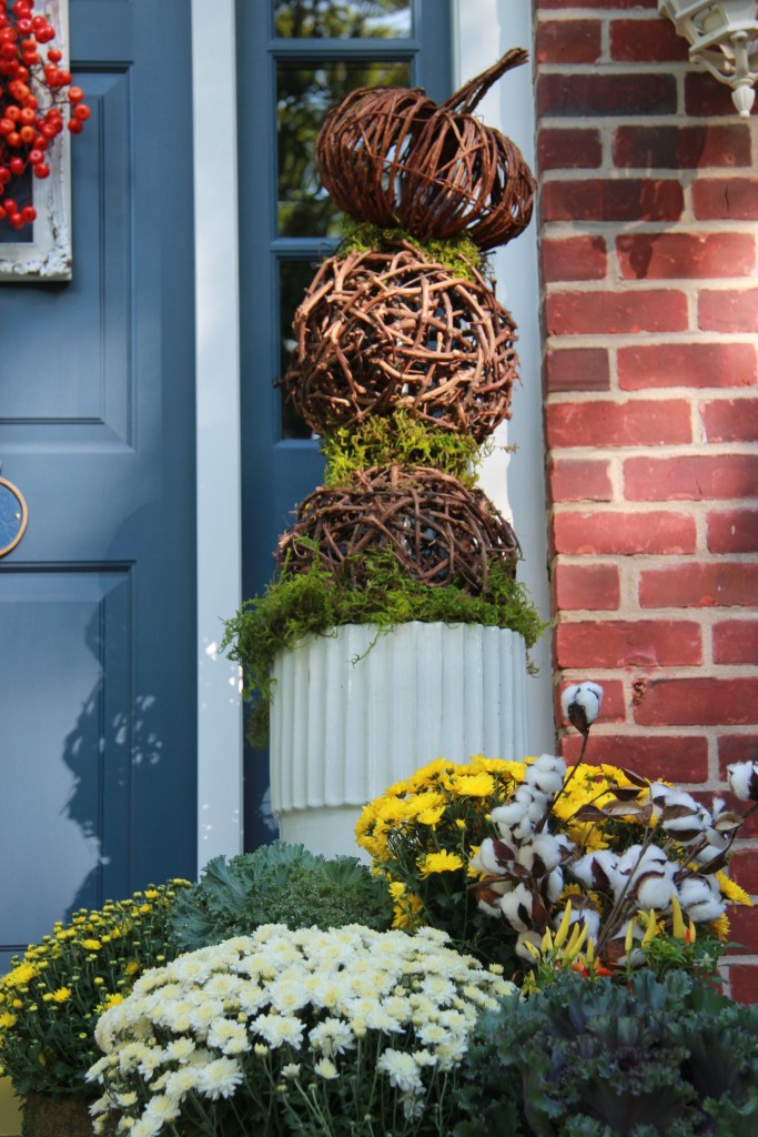
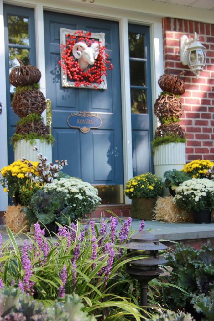
With that said, I decided to go with tall white ceramic planters, which I use year round,  to begin my design. Inside the planters I used grapevine orbs which I stacked on top of each other forming a topiary effect.  The top of the piece is a grapevine pumpkin.  I layered green moss between the 3 pieces.

Ram's Head on front door

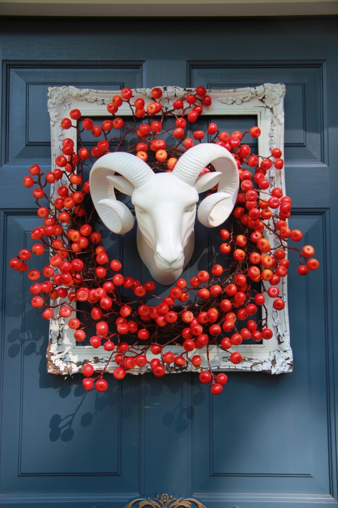
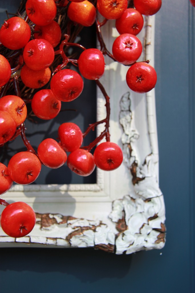
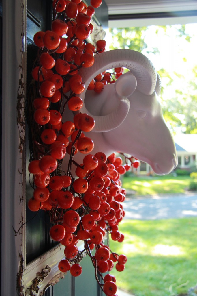
On my front door I hung a white rams head, framed it in a very old white painted picture frame, and then put a tangerine orange wreath around its neck.  I like the tangerine orange color rather than the muddy, rusty oranges which keeps everything fresher.

Front door frame and wreath detail

Ram's Head side view

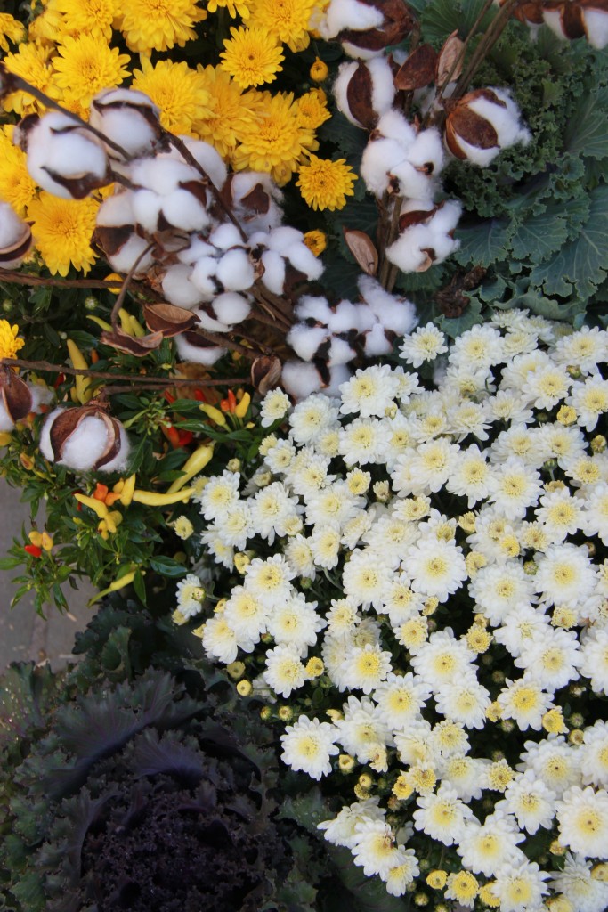
I finished my doorstep up with White Mums, Yellow Mums, ornamental peppers and cabbage plants.

Fall flowers

I am from the deep south and the fall season brings memories of the beginning of Hunting Season which I always hated because the deer are so beautiful. With that said, I love the idea of the fake Mounted Rams Head – much better than the real thing! These are very popular in Interior Design right now and you can find fabric, wood, plaster of paris, ceramic, and other decorative animal heads everywhere.  The Fall Season also means seeing the beautiful white cotton growing in the fields in South Georgia, where I am from, so of course I had to use the white cotton stems in my design as well.
Fall front door ground view
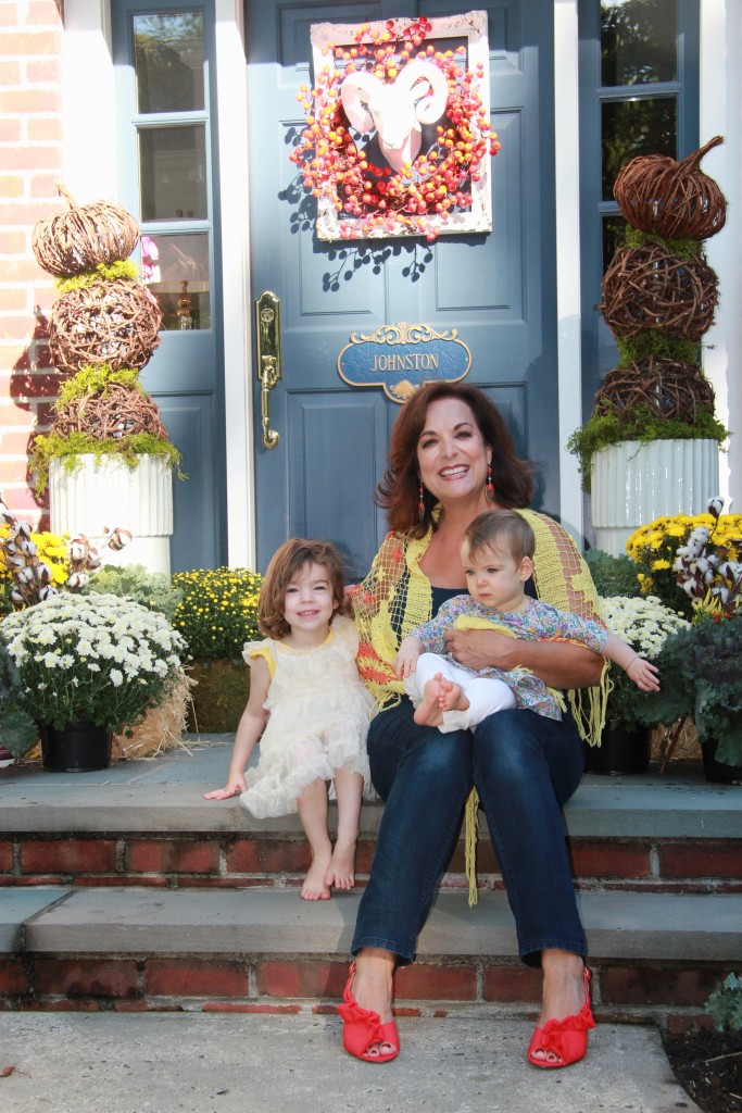
Patti with her granddaughters
I asked my 3 year old granddaughter what she thought of this front door decor. She said, “It’s funky!” I thought so too.
Happy Fall!
-Patti
Sources:  Michaels for the cotton stems and green moss.  Fort Hill Nursery and Home Depot for the plants.  Homegoods for the Rams Head and Wreath as well as the Orbs and Grapevine Pumpkins.  White Frame and Planters are from Patti Johnston Designs.
PJlongislandPulse

My Feature in Long Island Pulse Magazine

This month, I am honored to be featured in the June issue of Long Island Pulse Magazine.  I’d love to share with you the article below. You can also read it on the magazine’s website.

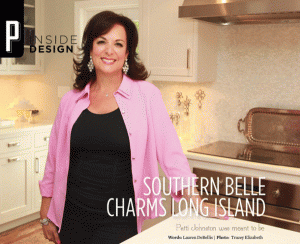
Southern Belle Charms Long Island

Patti Johnston was meant to be

Author: Lauren Debellis | Published: Sunday, May 20, 2012


Long Island Pulse magazine, June 2012


Patti Johnston of Patti Johnston Designs in Centerport knew early on while working in her mom’s fabric shop that she was meant to be a designer. Johnston now brings her sophisticated style and touch of Southern roots to clients on LI.
Long Island Pulse: How did you get started?
Patti Johnston: 
I loved to help at [my mother’s south Georgia]shop and she and my grandmother taught me to sew at a very young age. Good design and craftsmanship was so important to them. That’s where my love affair with design really began—with textiles.
After making my way to New York and working for F. Schumacher & Co., I joined a prominent interior design firm and learned about the business of interior design. Soon after, Patti Johnston Designs was born. My business is a culmination of years of experience designing for clients both domestically and internationally.
LIP: What is your design philosophy?
PJ:
  I love to include traditional accessories or antique furniture along with transitional pieces into my interiors, giving rooms a sense of gravitas. And entertaining is so important to me—I always think about the home as a place to gather and enjoy, and that is visible in my designs.
My signature use of saturated colors paired with cool neutrals carries through all my designs, however I always weave my client’s perspectives into each job that I take on. I strive to make my rooms strike that perfect balance between aesthetic and function—to make them as warm, inviting and livable as they are artistic and beautiful.
LIP: What are some current trends you are forecasting in the industry?
PJ:
 One trend that I am noticing is that Long Islanders are living less formally. I’m seeing the use of more informal and natural materials replacing more formal ones, such as brocades, silks and embroidered fabrics. They are being replaced by cotton and linen, especially in dining rooms.
Design Tip:  Interior designers can offer up so much more in addition to larger projects. If you’re in the market for something smaller, ask about special offerings such as upholstery work, artwork installation, holiday decorating or even a color consultation. A little boost can make a big difference.
DSC_0948

A Touch of Faux Bois

Faux Bois (French for false wood) is the artistic imitation of wood. Many artists and designers use this art form to create furniture, lighting, and textiles.

The grains and textures of trees are unique and beautiful.
It’s no wonder that so many people find inspiration for their homes from nature. 

Here are a few examples of faux bois pieces.  Incorporating a small amount of faux bois into a room can add a unique flair and an interesting conversation piece.

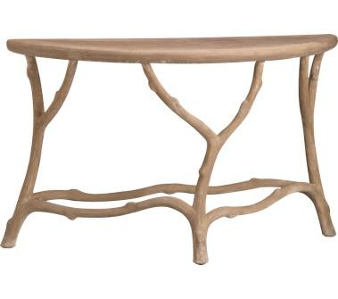
A console table from Crate & Barrel. This would look great centered under a mirror in a hallway or entrance. 
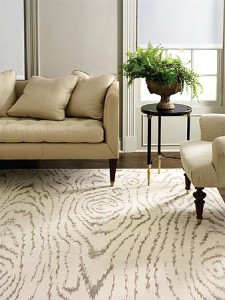
A wood-grain inspired rug from Martha Stewart

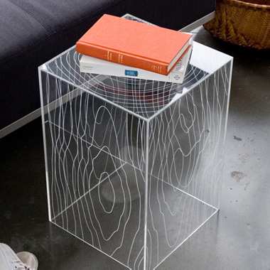
This acrylic Timber Table from Style Garage juxtaposes an organic pattern with a sleek and modern material.

You’ll be able to find an array of furniture, textiles, and many interesting details with the faux bois look with a simple search online. Maybe you’ll find the perfect piece that speaks to you!

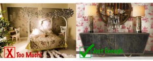
When decorating with this look, be careful not to add too many pieces. You do not want to cross the line from interesting and pulled together into a kitschy, theme decorated room!

On the left, a faux bois bed with a forest-themed bedspread, chairs, live plants, and wallpaper create an over the top setting. On the right, Julian Chichester creates a well-balanced space with symmetrical tree trunk lamps. 

If you’re looking to add a touch of faux bois to your home, you can contact me to help you find the perfect piece that works with your interiors. And remember, just a little goes a long way.

Green-Interior-Design

Inspiration: Kelly Green

You never know where you will find inspiration for your next design project. Recently, I came across a unique kelly green motorcycle that caught my eye during a morning stroll in the Garden District of New Orleans.

Kelly Green Motorcycle
A motorcycle that served as great color inspiration. 

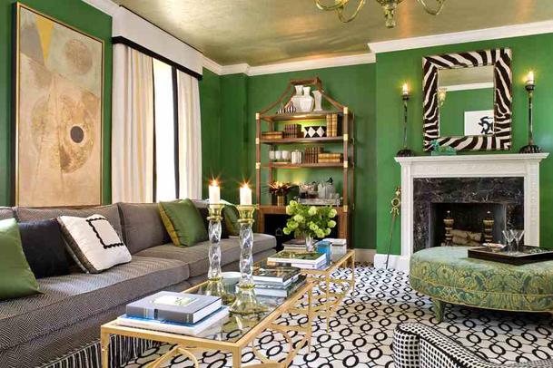
There are so many creative ways to decorate with this color scheme, for rooms that feel modern and really pop. I love the addition of geometric black and white patterns in the room below.

Kelly Green room
A green and black interior (from www.irene-turner.com).

The inspiration took on another dimension when my daughter stepped into the frame. With her blue shirt and bright orange purse, I saw possibilities for bright accent colors.

Kelly green and tangerine orange make a striking combination.

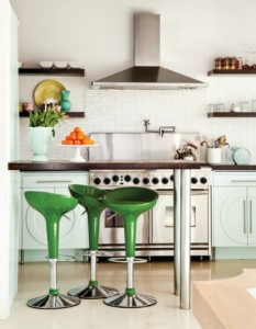
For instance, this kitchen gets a fresh, albeit subtle, spritz of orange from a bowl of fresh fruit. The oranges mix perfectly with the silver and kelly green.

Silver, Orange, and Kelly Green (from www.escapadeblog.com)

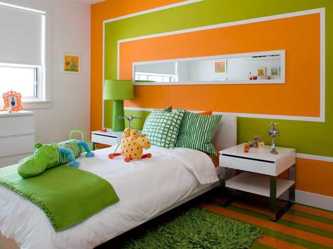
When the orange is increased from accent to an equal half of a room’s color scheme, the result is a very playful and cheerful room, which works well for a playroom or child’s bedroom.

A boy’s room in green and orange (from www.decorpad.com).

Shortly after I snapped the photo of the motorcycle, I was inspired by my daughter’s dog playing at a dog park. His grey and brown coat looked beautiful with the green grass and aqua kiddie pool. You truly never know when you will discover a new color scheme inspiration!

Kelly green grass + a bright blue pool + a grey and brown coat = inspiration for a possible future design color scheme
photo1

On Entertaining

When outfitting a beautifully designed room for a meal or a gathering, it’s so important to decorate the table, too. Choice of dishes, centerpieces, linens, and lighting will all set the mood for the event and should complement the design of the room. I like to make selections that fit with the occasion, the setting, and the time of year.
This weekend, my husband and I took part in a “progressive dinner.” A large group of us started out at one home, for drinks and appetizers. We hosted the entrée portion of the meal at our home, before all the diners headed on for dessert at another.
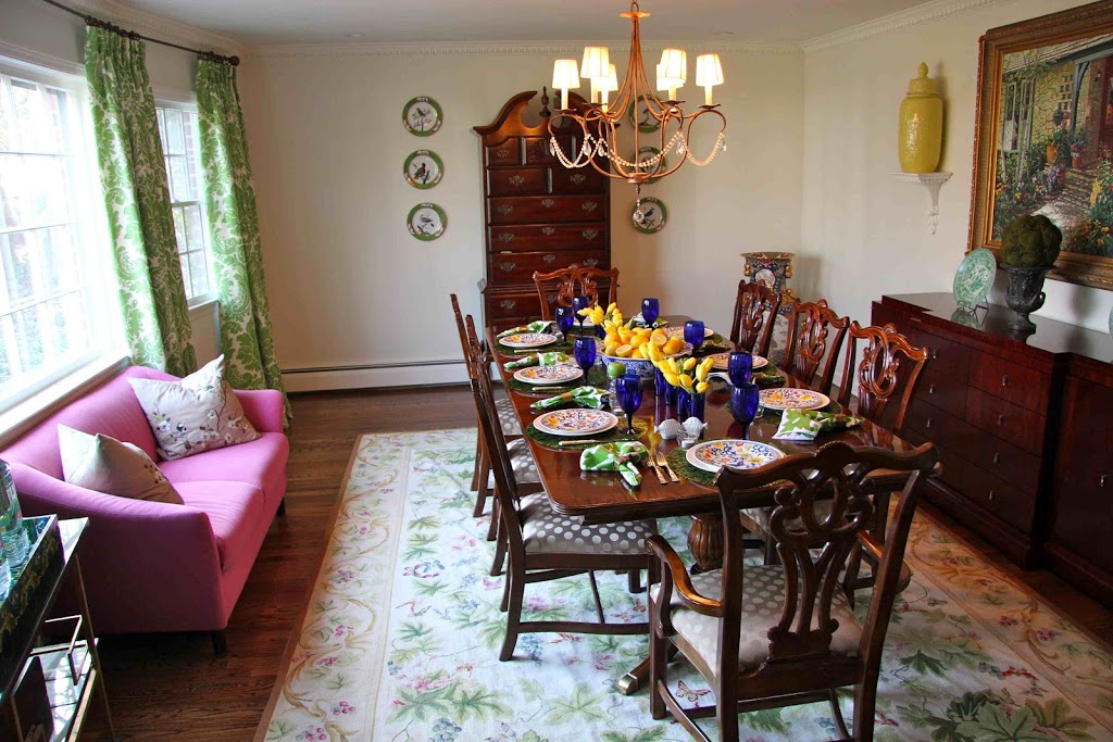
Since my kitchen renovation, my dining room has become more widely used for both formal and informal meals. To make it appropriate for both, I replaced the formal silk window treatments with informal large-scale cotton panels. The room has neutral bones but is colorful in its accents – including the wool rug and bright modern paintings – which provides lots of flexibility in setting the table using a variety of colors, textures, and objects.
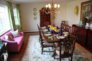
Dining Room

For this dinner, which took place on a warm March Long Island evening, I chose to capitalize on the feeling of spring!
Fresh yellow tulips at the local store were so inviting; I used cobalt juice glasses to arrange a colorful row of them down the mahogany table.

Tulips in Cobalt Glasses 
To anchor the table, I filled a large blue and white bowl full of fresh lemons – some sliced to add texture and fragrance.

Fresh Lemon Centerpiece 
Instead of a tablecloth, I placed dried boxwood placemats – a recent addition to my collection of accessories – at each setting, which further incorporated the fresh “earth” at the table.
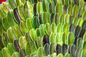
Boxwood Placemat, Detail
As in my interiors, I always try to achieve a balance when setting the table. One way I achieve this is by juxtaposing modern and traditional elements. My sterling silver “dresses up” the table but still works with the modern napkin design and the funky Jonathan Adler salt and pepper shakers.
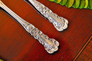
Traditional Silver
Jonathan Adler Salt and Pepper
I also juxtapose neutrals and bold, saturated colors. I paired my white Wedgewood china with colorful salad plates, tying together the fresh greens, cobalt blues, and lemon yellows of the color scheme. This room can handle a lot of color!
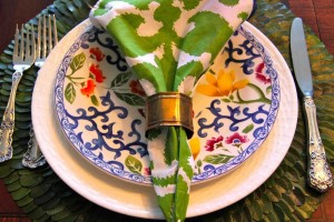
Place Setting
Apple candles and tea lights at each place setting provide just enough ambiance for a casual, yet special, dinner with friends.
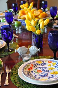
Set Table

photo11

Kitchen Renovation – Part III

Finally, the long-awaited final photos of the gut renovation to my kitchen and the final results of the many months of design decisions and construction . . .Ta da! 

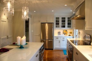
The new kitchen is both open and airy. The kitchen table was removed to create an open floor plan between the kitchen and the living room. The colors of the living room are glimpsed through the wide opening between the rooms, and the cool, soothing neutrals of the kitchen provide a contrast to the bold ceiling of the living room.
The kitchen is now as functional as it is beautiful. Workspaces abound, and appliances are placed to create a flow that makes it possible for several “cooks to be in the kitchen” at once! The white glass countertops sparkle, and yet are durable for prep and easy to clean. Cabinets extend to the ceiling, and drawers utilize every square inch of space so that the beautiful countertops needn’t be cluttered with tools. 
The creation of specific areas for specific tasks in the kitchen is essential. 

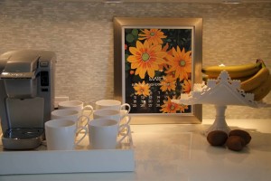
Here a coffee station houses things we use every morning: the coffee maker, mugs, fresh fruit, and my monthly calendar – one of my favorite things! 

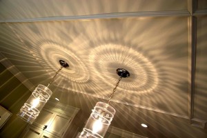
The pendant fixtures above the island cast a warm pattern of light on the ceilings and walls. I installed an applied ceiling trim for added interest above the island as a frame for the light fixtures. It subtly repeats the pattern on the window treatments in the adjoining room.
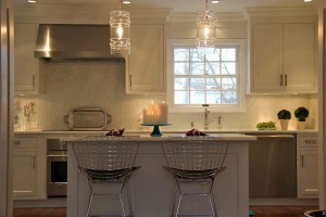
The stainless stools are very modern and make the island into a seating area as well as a preparation station. The island was designed to feel like a piece of furniture. 

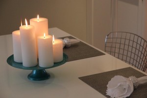
The inclusion of more traditional accessories warms the room and gives it a sense of gravitas – the antique silver tray behind the stove; inviting candles on a cake stand, the lace napkins.

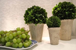
A pop of green is visible in the addition of “earth” in the room – here the collection of boxwoods and a platter of fresh green grapes bring some life to the space. 
Cooking and entertaining is a pleasure in the new and improved Patti Johnston Designs kitchen! But stay tuned, because the renovation of the kitchen spilled over into my den, and soon I’ll document that transformation as well . . .


1577

Kitchen Renovation – Part II

With the gutted kitchen a blank slate, it was time to make decisions about fixtures, colors, and materials. The layout of the room had been decided – the wall between the kitchen and living room was opened up and functional plans for the placement of cabinets, appliances, and a new island were set. 


The kitchen’s hardwood floors would be replaced and stained to match that of the other rooms for continuity and a seamless transition between the first floor spaces. For the walls, I chose Benjamin Moore’s Grey Owl – a cool, soothing neutral to compliment the grays, navies, apple greens, and fuschias in the adjoining rooms. For the cabinets, I chose Benjamin Moore’s White Wisp. 

White Wisp

Grey Owl

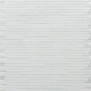
Instead of a traditional stone countertop, I chose a beautiful white glass material. Like granite, it is stain-proof and heatproof and is an excellent workspace. And it is more beautiful and unique than many stone options. The backsplash is also glass. It’s colors pick up the grey of the walls and cabinets. 

Backsplash

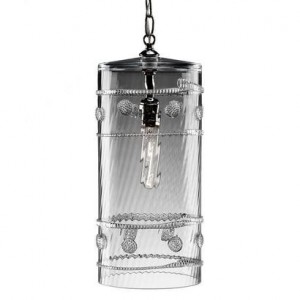
The light fixture that used to hang above the kitchen table was moved so that pendant lights could be installed above the new island. For this purpose I chose two delicate Juliska glass pendants.

Island Pendant

The hardware for the cabinets was an important choice. I chose something modern to contrast the more traditional cabinets in a shiny polished nickel finish. The latches are more interesting than a more traditional knob or pull and add further interest in the kitchen. 

Ice Box Latch
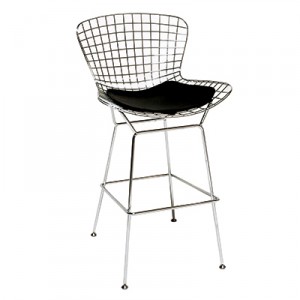
Finally, having given up my kitchen table and chairs to rely on my formal dining room more regularly for large family dinners, counter stools at the island were a must. I chose a wire net basket stool for this job, with a durable faux leather seat cushion. 
Basket Stool

Next up: photos from the finished room! 

ry-480

Kitchen Renovation – Part I

Despite a busy client schedule, I am always inspired to update my own home with the latest designs. This fall, we undertook a major renovation of my kitchen. Although it was always cozy and comfortable, the kitchen was small with inadequate counter space and a tiny oven. As an avid baker, the kitchen’s limited space did not afford me the space to really enjoy my time there. And as the heart of the home, with family often gathered around, the kitchen was too small for entertaining. 


The kitchen’s seating area, before

The project was long and extensive, but the results are beautiful. Here I’ll begin to detail the process of the renovation, from start to finish, with photos to document the process. 


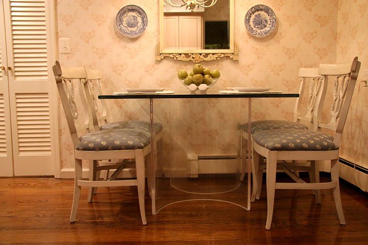
A lucite table helped to create the illusion of more space in the kitchen, which was separated from the living areas by walls and doors


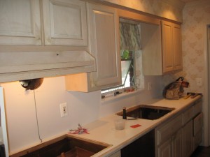
The gut renovation begins – the cabinets without appliances before they too disappear
Stay tuned for Part II and all the thoughts behind the design!


isabella

Lighting

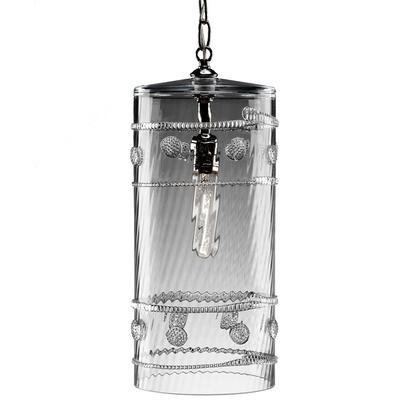
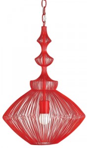
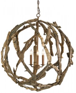
Happy New Year from Patti Johnston Designs! Even though the days in the northeast are slowly getting longer, I always appreciate—during the midwinter months—the importance of great lighting. Light fixtures are an integral part of every room’s design, and most lighting showrooms don’t offer pieces special enough to really shine. The best lighting sources are available to designers only. Here I’ll share some of my favorite overhead fixtures available only to the trade.

Juliska

Currey and Company

Currey and Company

luce_weinrib

Ikat

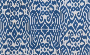
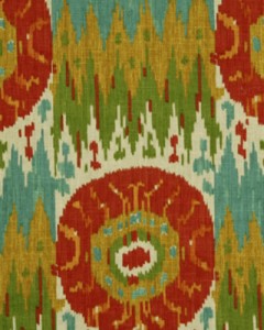
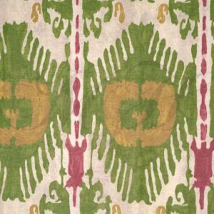
Ikat is a near universal weaving style common to many world cultures and possibly one of the oldest forms of textile decoration. This age-old dying technique used to pattern textiles is at once traditional and modern due to its long history but its continual rebirth in new lines of fabric. Here are some of my favorite new ikat prints!


Luce, from Madeline Weinrib’s New Fabric Line

From Robert Allen

From Scalamandre