DSC_0948

A Touch of Faux Bois

Faux Bois (French for false wood) is the artistic imitation of wood. Many artists and designers use this art form to create furniture, lighting, and textiles.

The grains and textures of trees are unique and beautiful.
It’s no wonder that so many people find inspiration for their homes from nature. 

Here are a few examples of faux bois pieces.  Incorporating a small amount of faux bois into a room can add a unique flair and an interesting conversation piece.

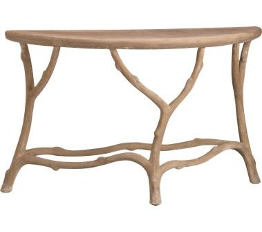
A console table from Crate & Barrel. This would look great centered under a mirror in a hallway or entrance. 
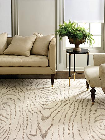
A wood-grain inspired rug from Martha Stewart

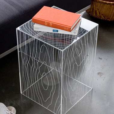
This acrylic Timber Table from Style Garage juxtaposes an organic pattern with a sleek and modern material.

You’ll be able to find an array of furniture, textiles, and many interesting details with the faux bois look with a simple search online. Maybe you’ll find the perfect piece that speaks to you!

When decorating with this look, be careful not to add too many pieces. You do not want to cross the line from interesting and pulled together into a kitschy, theme decorated room!

On the left, a faux bois bed with a forest-themed bedspread, chairs, live plants, and wallpaper create an over the top setting. On the right, Julian Chichester creates a well-balanced space with symmetrical tree trunk lamps. 

If you’re looking to add a touch of faux bois to your home, you can contact me to help you find the perfect piece that works with your interiors. And remember, just a little goes a long way.

photo1

On Entertaining

When outfitting a beautifully designed room for a meal or a gathering, it’s so important to decorate the table, too. Choice of dishes, centerpieces, linens, and lighting will all set the mood for the event and should complement the design of the room. I like to make selections that fit with the occasion, the setting, and the time of year.
This weekend, my husband and I took part in a “progressive dinner.” A large group of us started out at one home, for drinks and appetizers. We hosted the entrée portion of the meal at our home, before all the diners headed on for dessert at another.
Since my kitchen renovation, my dining room has become more widely used for both formal and informal meals. To make it appropriate for both, I replaced the formal silk window treatments with informal large-scale cotton panels. The room has neutral bones but is colorful in its accents – including the wool rug and bright modern paintings – which provides lots of flexibility in setting the table using a variety of colors, textures, and objects.

Dining Room

For this dinner, which took place on a warm March Long Island evening, I chose to capitalize on the feeling of spring!
Fresh yellow tulips at the local store were so inviting; I used cobalt juice glasses to arrange a colorful row of them down the mahogany table.

Tulips in Cobalt Glasses 
To anchor the table, I filled a large blue and white bowl full of fresh lemons – some sliced to add texture and fragrance.

Fresh Lemon Centerpiece 
Instead of a tablecloth, I placed dried boxwood placemats – a recent addition to my collection of accessories – at each setting, which further incorporated the fresh “earth” at the table.

Boxwood Placemat, Detail
As in my interiors, I always try to achieve a balance when setting the table. One way I achieve this is by juxtaposing modern and traditional elements. My sterling silver “dresses up” the table but still works with the modern napkin design and the funky Jonathan Adler salt and pepper shakers.

Traditional Silver
Jonathan Adler Salt and Pepper
I also juxtapose neutrals and bold, saturated colors. I paired my white Wedgewood china with colorful salad plates, tying together the fresh greens, cobalt blues, and lemon yellows of the color scheme. This room can handle a lot of color!

Place Setting
Apple candles and tea lights at each place setting provide just enough ambiance for a casual, yet special, dinner with friends.

Set Table

ry-480

Kitchen Renovation – Part I

Despite a busy client schedule, I am always inspired to update my own home with the latest designs. This fall, we undertook a major renovation of my kitchen. Although it was always cozy and comfortable, the kitchen was small with inadequate counter space and a tiny oven. As an avid baker, the kitchen’s limited space did not afford me the space to really enjoy my time there. And as the heart of the home, with family often gathered around, the kitchen was too small for entertaining. 


The kitchen’s seating area, before

The project was long and extensive, but the results are beautiful. Here I’ll begin to detail the process of the renovation, from start to finish, with photos to document the process. 


A lucite table helped to create the illusion of more space in the kitchen, which was separated from the living areas by walls and doors


The gut renovation begins – the cabinets without appliances before they too disappear
Stay tuned for Part II and all the thoughts behind the design!


isabella

Lighting

Happy New Year from Patti Johnston Designs! Even though the days in the northeast are slowly getting longer, I always appreciate—during the midwinter months—the importance of great lighting. Light fixtures are an integral part of every room’s design, and most lighting showrooms don’t offer pieces special enough to really shine. The best lighting sources are available to designers only. Here I’ll share some of my favorite overhead fixtures available only to the trade.

Juliska

Currey and Company

Currey and Company

luce_weinrib

Ikat

Ikat is a near universal weaving style common to many world cultures and possibly one of the oldest forms of textile decoration. This age-old dying technique used to pattern textiles is at once traditional and modern due to its long history but its continual rebirth in new lines of fabric. Here are some of my favorite new ikat prints!


Luce, from Madeline Weinrib’s New Fabric Line

From Robert Allen

From Scalamandre


Showhouse-2011-010

Showhouse!

After a busy summer, the latest Patti Johnston Designs fall undertaking was the 2011 Mansions and Millionaires Design Showcase 2011. Patti Johnston Designs took a second-floor foyer and closet and turned it into a sparkling “Boudoir” – an intimate, elegant dressing room combining classic and modern elements.  

The Space, Before

Boudoir is a space that combines the elegance of classical furniture with modern color and details—preserving the old world feel while bringing the room into the 21st century for today’s woman and man. I chose a color pallet of gray and white, infused with pops of bright turquoise. The closet doors were painted gunmetal grey to ground the room in tradition and are labeled “his,” “her’s,” and “ours.” 

The Space, After

I discovered the ornate vintage picture frames in the attic of a “frame hoarder.” After determining the ideal layout of the frames for the wall, I had them lacquered a glossy white.


The Frames, Arranged, Before

I wallpapered the ceiling with a modern botanical. The ferns are reminiscent of the home’s beautiful grounds, and introduce an organic motif in the space, which is complemented by the spectacular installation on the wall. The Sculpt du Fleur is a custom floral element created by Nina Helms, incorporating both European influence and contemporary shapes. 

The turn-of-the century vanity and the pier mirror were finds I discovered during an antiques shopping trip in France. They have been restored and rejuvenated with fresh paint and metallic leaf detail. The black lacquered legs of the stools are reminiscent of French design as well. 


Vintage Jewelry Displayed on the Vanity

In keeping with the room’s true purpose, I “dressed” the window treatment in filmy white fabric trimmed with gorgeous turquoise satin, fabric reminiscent of a beautiful ball gown.


Window Treatment Detail 
CAPRI-BLUE

My Favorite Things

Here is my must-have list . . . the ten things I couldn’t conceive of living without. 


1. Volcano scented candles from Anthropologie 

Volcano Candle

2. Vintage jewelry 

Pink Schreiner Pin
3. Decorating with shells

4. Dune fragrance 
Dune Fragrance by Dior

5. My beautiful bathtub – “Tea for Two” by Kohler 

Patti Johnston Designs Porfolio

6. Going out to breakfast


7. My KitchenAid Artisan Stand Mixer

Susan G. Komen KitchenAid Stand Mixer

8. Weekly reflexology massages


9. Searching for and purchasing mid-century furniture 

Century Design Ltd, Midcentury Slipper Chairs

10. Junior League cook books 

New York Junior League Cookbook

IMG_5644

Paper Projects

Wallpaper can be a misnomer, because limiting wallpaper to the walls would be so restricting! I also like to think of wallpaper as…

…ceiling paper.
Papered Ceiling
…on the back of a simple bookshelf, for a striking backdrop to a collection. 
Lucky Magazine
…on furniture. Furniture pieces can be custom upholstered in textured paper and then painted. This one is a lacquered grasscloth. 
Bungalow 5, on Polyvore
…on the treads of your staircase. 

Moroccan Stencil Staircase, via Style-Files.com

…as art. A great statement idea if you are renting your space, so you can take your wallpaper with you if you move.

Credits: Domino Magazine

Of course, wallpaper is beautiful on the walls. Here are a few Patti Johnston Designs wallpaper favorites for all your paper projects. 

Romo


Nina Campbell

Sanderson

Designer’s Guild
Cole and Son

Purple Hyacinth ca. 2001

Perfect Purples and Blues for Spring

Spring on Long Island always brings to my mind rich blues and purples . . . from the sunny skies reflecting off the sound, to brightly hued purple hyacinths popping up on the front lawn, to the robins’ eggs that reappear each year on our back deck. 
Better Homes and Gardens Magazine
 Last year, during one of my favorite annual New York City events – the biannual New York Junior League House Tour – one of the featured homes was the Grammercy Park town home featured on the magazine page below. The otherwise neutral kitchen’s spectacular ceiling was painted a rich hyacinth purple, which was complemented by purply hues in the art, on the painted floor, and in accessories. 


Better Homes and Garden Magazine


True blues are so fresh and inspiring after the icy whites of wintry skies, and I’m turning to a few favorite blues in my springtime design plans. (All swatches courtesy House Beautiful.) 

Benjamin Moore ‘Blue Wave’ 
Benjamin Moore ‘Glass Slipper’

Benjamin Moore ‘Iceberg’

Benjamin Moore ‘Paladian Blue’

Benjamin Moore ‘Silver Grey’

Benjamin Moore ‘Silvery Blue’

Farrow & Ball ‘Borrowed Light’

A P.S. to any New York based blog readers. The New York Junior League Sixteenth Annual Spring House Tour is Saturday, May 7th, and is an exceptional event that I always enjoy! Details of the event are on the below invitation. 


Damien_Hirst_dots

Lots of Dots

I love the shape of a circle and I use it over and over in my design projects. I find comfort in the round edges and the idea that there is no beginning or end (very Zen!). Whether it’s a print on a fabric or wallpaper, the rounds in an art piece, or accessories, I can’t think of a dot I’ve ever met that I didn’t like!

Art by Damien Hirsht

A few examples of my dot obsession:

Egg prints.
A bowl full of interesting accessories.
Dishes on display.
The medallion shape on this great pillow fabric.
Right now I’m working on selecting a fabric for a glamorous bedroom marrying rich black lacquer with luxurious metallic grays. You guessed it! A beautiful fabric with dots is what I think will do the trick. It’s hard to decide; they are all so beautiful in their different scales!